Monday, October 3, 2011

Artist of the Month

Just a quick note:

I am pleased to announce that I have been selected as artist of the month by Trekell. An excellent brush company out of California:


If you have a chance, do visit their website. I (being the material slut that I am) never hesitate to recommend a product or service I have discovered that is truly exceptional.

More posts to follow soon, I'm right in the middle of manically producing painting for my Gallery in Santa fe. And unlike painting, I am very bad at multi-tasking.

-F

Tuesday, September 13, 2011

The anatomy of painting (III of III)

I've entitled this series of post "The anatomy of a painting" for two reasons. First, I like titles to have five words and at least one preposition. It makes it sound like I'm very smart. I have degree that I paid a lot of money for and I feel like I should be using it in one way or another even if it's only to make me feel good about myself. Secondly, I think the title is appropriate. Paintings have an anatomy. They have a bone structure that keeps everything in place (the drawing) they have muscles that control it's movement (values) and they occasionally wear lipstick and perfume to get your attention (colour) Also they can wear too much lipstick and perfume and look like they are trying too hard. (i.e Diebenkorn)

So today we get into the makeup. Hopefully what I'm showing you is the equivalent of the "smokey eye effect" and not the "mutton dressed as lamb" effect. Firstly, a refresher as to where we left off:


Bones and Muscles. (Not really, but kinda)

when i got into teaching the phrase I would inevitably hear was "I can't learn to draw, I can;t even make a straight line without a ruler". My answer was always, "neither can I". Tromp l'oeil rests on the ability to form tight lines that separated the objects from their backgrounds. Because of this straight lines are fairly important, compulsory even. in fact they are so important they would require a longer word than compulsory but I can think of one at the moment.

So, being that I am "straight line handicapped" and painting with a ruler is way more work than it sounds like, what the solution. The answer my friend, is tape.The edges of the tape are carefully mapped to the changing contours of the postcard. I used very small pieces, maybe 3/4 of an inch at a time, in order to perfectly mask off the postcard from what would become the wood background.


This is tape. And it is awesome

At this point the painting is finished and I can sign it. what? Paint? Ok fine.

The wood grain is basically a mix of Transparent Iron Oxide, Mars Black and a little Mars Violet and Cadmium Red to adjust the temperature.

Mars Violet isn't in this picture
because she's camera shy.

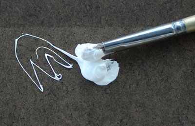
The white in the picture is a actually a mix between Williamsburg Flake white and Davis Davis Titanium White (known as the "Gluck" white as it was mixed to specifications by the founder of Mission Renaissance, a private art school in California.) Also the oil on the palette is M. Graham's Walnut oil. I included just a little of in the white mixture as the Williamsburg can be described as "stiff" and the Gluck white is "ropey". "Stropey" white was not what I wanted so the walnut oil smooths that out a bit. Why not Linseed oil you ask? Walnut oil is thinner and faster so it takes less oil to thin the paint to the desired consistency. Too much oil can contribute to cracking and yellowing.

At this point with the paint mixed I can begin applying the background. Since the wood is so dark it was pretty evident it needed to go on first as it surrounded the postcard and would influence the values I chose later:

Transparent Iron Oxide: a good influence
on unruly colours.

Close up.

While I spent a good deal of time mixing the "perfect" white, white was not used in the initial pass over the wood grain. In the close up you can see I've started to incorporate the "grain effect" on the left side while the initial base color is still being applied on the right. I like to work as I go rather than fully applying the paint in layers. Normally I would "tone" the canvas with a light wash on a neutral color, maybe a gray or mustardy wash. But since I am not using white here, I'm letting the white of the canvas show through to give me an impression of lighter wood.

After the initial layer of paint was allowed to dry (overnight) the wood grain was enhanced with a very limited amount of white added into the wood mixture. The tape above the card was painted and the shadows were darkened. for those of you interested, I did not use walnut oil other than in the white mixture (it dries too slow). The wood mixture was mixed with Oleo-Resin medium from Michael Harding. Basically: canada balsam, turpentine, stand oil and a drier (cobalt I think). It dried quickly has great handling and allowed me to thin the paint enough for the white ground to show through:

The completed wood grain

From here I could remove the tape and begin the figures and white border. The painting of the figures was relatively straight forward. The white border not so much. If you remember from the previous post I had rigged a complex light blocking "unicorn" to solve the fact that I had multiple light sources. This proved impractical. I removed the overhang early in the painting process but the dual light source was screwing with my ability to make the shadows and the highlights on the white border "read" properly.

It's purdy. But it don't read too good.

As you can see in the above photo I've turned off the spot light on the left causing the slanting show to disappear. Ultimately I thought this strengthened the illusion. The dual light source just seemed confusing. So I turned off the second light and just used the overhead light:


By George I think she's got it.

This concludes the series on the making of 'Degas "Dancers in Blue"'. I plan on doing a series of Tromp l'oeil paintings on similar themes as soon as I finish a few still-life's which have been requested by Mark Greenberg who carries my work in Santa Fe, NM at Greenberg Fine Art. Degas "Dancers in Blue" will also be showing there at the end of the month. Stay tuned for more painting madness and possibly, pictures of bunnies.

-F

Degas "Dancers in Blue" oil on linen 10" x 10"


Tuesday, September 6, 2011

The anatomy of a painting. (II of III)

So. To continue.

The preparation of a support is tremendously important. It is, very literally, the foundation on which a painting is built. In a sense preparing a suitable canvas requires a lot of time and effort. So much so sometimes, that it's almost a shame to paint on it.

But that aside it's time to start the set up, which looks something like this:


Sight size. It's where it's at baby.

So what are we talking about here? Sight size. Basically, sight size is a method of drawing where the canvas and your subject are set up to be exactly the same size. You can see I've marked out the board (a spare shelf from my tré-chic IKEA bookshelf) with blue painters tape at a 10" square on the button.

At this point I feel I should confess something. I am measuring addict. I have several methods of measuring when I'm drawing I use a plumb line nearly as much as I use a pencil much in the manner shown here:


Incidentally, this isn't a photo of my hand.
My hand is much more muscular and manly.

And while I don't use a ruler, I do use a stick to measure similar distances. (I'm not going to post a picture of a stick. That would be silly). To do this I simply mark the distance between two points on my stick and compare the same two distances on my drawing. If one is bigger than the other, I fix it. If it's not, I leave it. I do this with EVERYTHING (and I mean everything). If you do it correctly you will end up with something like this:

Taaa-Dahhh!

You can see pretty clearly that all the important dimensions and shadows are appropriately marked. I've also used some place holder sketching to mark my shadows. I am a painter who is big on notation. I do not thoroughly draw everything but I do mark just about everything for later use. If you look closely at the picture you can see pieces of tape affixed to the edges of the wood. Those tape pieces are color-note numbers which match color swatches I've mixed on a small piece of canvas near my palette.

A good tromp l'oeil is dead sexy. To make tromp l'oeil work, the depth of field needs to be incredibly shallow. In my opinion a convincing illusion can be maintained with a depth of field of up to 3 inches. Anything more than that requires the viewer to be standing in just the right place for the illusion to work. Granted there have been very successful tromp l'oeil ceilings and even chalk sidewalks paintings. but again, if viewed from the wrong angle, the illusion fails. (for example of this check out more of Julian Beever's sidewalk art and check out the last one (http://www.squidoo.com/julianbeever)

In order to really nail down that depth of field the lighting has to be correct. I have several studio lights that I use for paintings. And fortunately, both are out of frame in this shot (fail).

"Unnecessarily complicated" Party of 1, your
table is now available.

I have a 600Watt spot light which is coming in from the side and a pair of daylight corrected fluorescents over the set up. The Macgyver'ed paper towel roll contraption is to prevent me from having two light sources on my subject, as I wanted the shadow on the right hand side to be as strong as possible to reenforce the shallow depth of field. (Eventually I would reconsider that decision)

After all is said and done, this is what the final painting set up looks like:


The taped-off board is actually
a mystical unicorn in disguise.

The next installment will cover the painting and it will be the most awesome post of the three. To prove this, here is a picture of a stapler:

Stapler?

Which has very little to do with anything.

-F


Thursday, September 1, 2011

The anatomy of a painting.


When I started painting I scoured, positively scoured the internet for information on painting, supports, supplies and archival information. For every bit of data I can across that was worthwhile I found huge swathes of information that was... sub par. On top of that I never really got to see the intricacies of what went into painting; why use a pva size and not rabbitskin glue? Why use a alkyd primer and not a titanium white? why use black oil and not linseed? Poppy? Safflower? Heat-bodied walnut with turps?! AGGGHHHH!!!

And then my head would explode.

After I spent the next few hours carefully putting my head back together (not unlike one Mr. Dumpty, first name: Humpty) I carefully trolled through what information I had and did several test runs to see what worked and what didn't.

So, this blog post will be a start to finish (in three parts) chronicle of one painting. From the preparation of the support and ground to the final touches:


Degas "Dancers in Blue" 10" x 10" oil on linen

The first matter of business was to select a support. Don't get me wrong, I like stretched canvas. But I wanted something with a bit more resistance to the touch. sometimes the firmness of the support makes painting easier for smaller more detailed work. The canvas I used had some wrinkles was well, and it's been my experience that stretching canvas doesn't remove wrinkles. So I used a 10" x 10" square of birch plywood with a 1/4 inch cradle.

so... strong.....

Yet so.... thin!

Yes, so I cut a piece of Utrecht 66J fine texture single weave linen. Fine texture single weave makes a thin painting surface without all the Goddam bumps to hind the application of paint.

Square canvas, square support. It's
like I went to college or something.

So, with the canvas cut it was time to size the linen. Linen requires a barrier between it and the paint otherwise the acidity of the oil will, over time, eat through the linen like a bunny through the gate that you put up to keep it from eating you new pair of shoes that You Bought Expressly Because YOU NEEDED A NICE PAIR OF SHOES FOR YOUR SISTERS WEDDING!!!!

Ahem.

So I've recently switched to the use of PVA glue because hide glue tends to absorb moisture from the air and over time may shrink and expand causing cracks in the painting. So after a coat of PVA, I need to adhere the canvas to the support. Again PVA glue was my choice for similar reasons stated above. Incidentally, PVA is a acid neutral glue similar to Elmer's. However it is a lot thinner.

This resulted in unforeseen problem. Namely the bloody canvas failed to adhere to the support. As such i attempted two methods of trying tog et it to stick

Method # 1 Pressing it by hand:

The man (aka me) trying to keep
a good canvas down.

I can tell you from experience this method of attempting to smooth the canvas down with hand pressure is only successful if you are trying to do two things.

1. Get glue on your hands.

For this, pressing the canvas down with your hands if very good. The heat of your hands caused the glue to cure on everything but the canvas. So you can be sure that the use of this method of adhesion will prevent any glue from drying on your canvas and provide maximum coverage on your fingers. If you happen to have any hair on your hands or arms be assured they you won't by time you remove the glue. PVA is surprisingly an excellent alternative to wax.

2. If you are attempting to tire your arm out.

Again, the above method is excellent for attempting to wear your arms down in to worthless stumps. Combined with glue covered fingers it is excellent for rendering your entire upper body useless and makes that face push-up you have to do to get out of bed the next morning all the more enjoyable.

Method #2 MacGyver


I was considering using some spare string and
a paper clip to make an atomic bomb and
blow the damn thing up after this.

Again. this method was also fail. While i didn't have glue covered hands, I still had to do the morning face push-up due to EXTREME arm fatigue.

(Warning: useful bit of information coming up)

So I did a bit of research. The reason you don't use Elmer's glue is because of its acidity. As mentioned before (acid+canvas = bunnies+VERY EXPENSIVE SHOES). But its all I had so... do I dare? Then I came across this bit of info from Ross Merill, who is the chief conservator of the National Gallery of Art in Washington D.C.:

"I wouldn’t recommend using Elmer’s white glue since it’s acidic. But when you think about it, the plywood, Masonite and fabric are all acidic, as well, but to a lesser degree. If you decide to use Elmer’s, mix a half cup of powdered white chalk (available at hardware stores) with a cup of water. Then add that to a quart of Elmer’s glue. Adding the chalk directly to the Elmer’s glue will result in a very thick paste. If it’s too thick to thoroughly mix, add just enough water to make it workable. This chalk (calcium carbonate) will neutralize the acidity of the Elmer’s glue."

Chalk is basically calcium carbonate. Which I have on hand for making traditional gesso. After mixing the calcium carbonate I ended up with a glue/chalk mixture something around consistency of maple syrup:


Although it moves like maple syrup
it's not.


You can easily see the viscosity here, what you
don't see is the PVA, because its too thin to
show up on film. Not unlike Calista Flockheart.

Much like the farmer who had a dog, I exclaimed "Bingo"! The new glue mixture was thick enough to hold the canvas in place. Enough for me to prime anyway...

The next installment will give a run though of the set-up and paints. Stay tuned or I'll send my killer attack bunny after you:


She May look cute, but she'll bite your face off.
And then your shoes.

-F

Tuesday, August 23, 2011

Why Plein Air painting is so damn hard.


It is pretty safe to say that I am primarily a studio painter.

In some ways this developed almost by accident. I was trained indoors. My easel was heavy and didn't lend itself well to being lugged around outside; and the people I painted with were, generally speaking, not strong enough painters to feel comfortable working out in the open air.

As my painting skilled developed and my style began to show itself, the subjects I chose just lent themselves well to studio painting. I was trained with a mind toward a very simplistic set-up and method. I didn't know anything about Munsel notation, color strings, split compliments or the use of any brushes other than hog's hair.

I began experimenting with materials. I am a huge believer in experimentation. But like any good scientist experimentation required a control. In order to fairly judge the strengths and weaknesses on any particular support, medium, paint or brush, you have be able to reproduce the results. In essence, gaining mastery over something is the ability to control every aspect of a field of knowledge and get every facet to behave in a predicable way.

Essentially, mastery of painting is an exercise in making paint behave predictably.

But painting outside is an entirely different creature. Not only is there more information, there more distractions, more decisions, more editing, more weather and possibly most frustrating of all; more light.

Cathedral Park

St John's Bridge at Cathedral Park 11" x 14"

That doesn't mean that it always turns out bad. In fact, I have gotten some very good paintings from trips around Portland and have probably sold as many plein-air paintings as I have studio paintings. What I haven't been able to do however, is create good paintings consistently. As I said, the light drives me, how shall I say? Ah yes.... Bat-shit crazy. While the changing light is one thing, what really drives me up the wall is that the light outside is so much stronger than the light inside. Just to be scientific about it direct sunlight has a light measurement of 32,000 - 130,00 lux. The light inside? 50-60 lux, maybe 80 in the bathroom.

This frustrates the hell out of me particularly because what you see isn't what you necessarily end up with.

It's sort of like going out on a date. It's really nice, the candlelight is enchanting, there's soft music your digging the scene and then when you get back to your house you realize it's not that hot redhead from the office, it's OMG your cousin Kenny! And he hasn't showered! Or maybe it is that hot redhead from the office. You can never be sure till you get it home.

I am used to being able to control nearly all the aspects of painting from the materials I use, to the lighting and composition. painting outside doesn't grant you the same liberties that working in the studio does.

All in all, I'm not breaking up with plein-air but we are not currently on speaking terms.

-F


Tuesday, August 16, 2011

Diary of a.... paint slut?


I am a paint slut.

I say this in the nicest possible way. While most painters are very very monogamous when it come to their materials, their pallets and their techniques I am not. I am an absolute raging paint slutty slutty slut-slut. I vacillate between single weave linen to heavyweight cotton duck, to clayboard, to rabbit-skin glue gesso primed medium-density fiberboard to PVA sealed birch hardboard to black-oil titanium primed linen affixed to high-denisty fiberboard with rabbit-skin glue. It's like the 1960's "free love" when it comes to choosing materials for a new painting except there is showering and deodorant involved (with me, not my materials).

Now, firstly, for anybody reading who doesn't know my work (how the hell did you end up here anyway?) I am primarily a miniature painter. That is to say very often my canvases lean toward the small size. For me, a full figure interior scene screams 8" x 10", 8" x 10"!! So very often this small work requires a real attention to the preparation of your support (canvas). as I've said above I though I would briefly run through some canvas I've recently used and give you the benefit of my morally questionable love affair with some of the many many types of painting surfaces:

Double weave 10 oz cotton duck:


Love it. It's real a workhorse canvas. I use it mainly on the canvases where I need the weight behind the brush. Because of the weight and the texture I rarely mount this to board. Generally speaking, I know some painters who prefer to paint on board (like my good friend Thomas Kitts. You can see his blog here; well worth the read) for the stability. Canvas affixed to board tends to have less of a problem with cracking than stretched paintings. Wanna know why? Because store bought canvas is, more often than not, improperly stretched. A good heavy weight canvas like cotton duck, if properly stretched, sized and primed is as archival as anything else. And when you start working bigger than, oh say, 14" x 18", mounting canvas on panel starts to become impractical.

Utrecht Double-Weave 9oz linen medium smooth texture:


The difference between this and cotton? Not a whole hell of a lot actually as far as painting texture goes. There are some who are uber-canvas snobs and who will paint on nothing but the finest belgian linen and those guys would love this stuff.

At this point, I feel it very important to stress that those guys are, simply put; Canvas Nazis. In the end it comes down entirely to personal preference which support you decide to use. I feel that one of the main differences between me and other painters is that I vary my support to take advantage of whatever subject I happen to painting.

In my opinion, the main advantage to linen lies with the finer weaves (which I'll get into in a moment). But those finer weaves become more of a hindrance than a help when it comes to working with larger canvases. Small brushes love a fine weave of linen and a rougher weave like two canvases above chew the hell out of them. If you are using a hog-hair or a similar synthetic why bother using a fine weave? They are too dumb a brush to notice. So why use a medium smooth weave 9 oz linen over a 10 oz double-weave cotton? The only advantage I can see lies in it's stretching.

Linen has less give than cotton does. In fact, dry unwashed linen will have almost no give at all when being stretched. While this does make stretching more difficult it does seem to allow you to keep the warp and weft (the lines you see in the weave) square to the stretcher edges. Who cares? Nobody really. That is until 250 years have gone by when the painting on the cotton canvas is cracking because the tension on the cotton thread is uneven due to improper alignment and stretching...

Michael Levine's lightweight unbleached clothes linen. Probably about 5oz.


Now this is interesting. I did experiment with a "apparel-grade" (I made that term up) clothes linen I bought downtown at Michael Levines (a sort of "fabric emporium" in the garment district of downtown Los Angeles.) You can readily see that the weave is far looser than an artist grade linen that is sold by Utrecht or Dick Blick. The verdict? Awesome for studies and at roughly 60% of the cost the price is certainly right. As to the archival quality, that I cannot vouch for. So I wouldn't go using it for the portrait commission you just received for the Duke of Edinburgh. Working out compositions? Yes.

Blick single-weave smooth "portrait grade" canvas 7oz.


For my miniature or highly detailed portrait work this is my go-to canvas. With a coat of PVA and maybe two coats of an acrylic gesso so that the canvas retains its toothy texture without impeding the flow of the paint of the brush.

The only drawback to this canvas is that it really is specialized. I attempted to use this once for a large still life 12" x 24". Man; worst. idea. ever. This is was before I started using the Kervin Mongoose Hair filberts , and as such I was using Chung-king hog's hair. Because the canvas has such a fine texture every single brush mark is visible. If you are a landscape painter this might be advantageous; especially if mounted on panel.

Utrecht Single weave 8.5 oz linen "66J" fine texture:


At the moment this is a new canvas for me. I picked some up yesterday for a tromp l'oeil I'm starting. From initial impressions I can say that there isn't too much difference I can see between this and Dick Blick portrait weave I have become so fond of. It is heavier, but only by 1.5 oz. The texture is only very minimally more pronounced than the 7oz portrait weave and I'm fairly certain you would be hard pressed to "touch-tell" the difference between this and the Blick. I have noticed however the tendency of the canvas to wrinkle which is giving me fits when attempting to apply it to a birch hardboard. To be fair however, I didn't watch the Blick linen before I used it which is not in itself a horrific faux pas. It just means that the starch wasn't fully removed (which adds an extra chemical in the cocktail. Albeit a relatively inert one)

As a final note. I nearly always buy unprimed canvas. It is sold primed which is awesome if you are lazy and don't care about having total control over the painting process. (I know, cheap shot right?) but I have experimented with primed canvas. Fredrick's makes a decent acrylic primed cotton canvas though it does have an oddly smooth texture. But really the main reason I do not buy primed canvas anymore is as follows:

Unknown brand (My guess is that it is produced by Satan in hell) Single weave linen canvas pre-primed with lead white. Probably about 5-7 oz. smooth texture.


Awful Awful stuff. I was given this canvas by another painter who had reached the same conclusion. It does not stretch well. In fact when I attempted to stretch it, the primer cracked.

Whiskey. Tango. Foxtrot?

It would not easily mount on board either; bubbling and peeling off the support all over the damn place. When I did manage to get it reasonably mounted painting was like wrestling a bear. When you take a close look at the surface, the application of the lead white ground is fairly uniform and you can just see the tips of the weave creating what looks like a textured surface. Lies. LIES. It's like painting on glass. Glass coated with Vaseline. Even my fine brushes (mongoose and/or sable) couldn't make a uniform stroke.

I asked a friend about it and he suggested I give it a coat of wax to help the paint adhere. I suggested he hand me a shovel so I can bury the fucking roll in my backyard. Never again.

Anybody interested in taking it off my hands? Please?

Well. That's enough of a foray into my probably low self-esteem induced trysts with various canvases. Later on there will be more info on mediums, paints, panels and projects than you can shake a pamphlet on material monogamy/abstinence at me and shout about how my grandmother would be ashamed of my behavior.

Genius out.

-F


New Beginnings

Ok, So:

Today marks a transition in the very small bloggosphere that exists here at Diary of a Genius. For the last few years I have mainly posted small excerpts of my life phrased as either comedic hyperbole (like when I told somebody that I wanted a flock of flying squirrels for my birthday) or prose rich moments where I am filled with inspiration (we all know how much I like deserts.)

However, this blog is transitioning into a more professional capacity one which will be exploring painting; in all it's technical, aesthetic and occasionally tragic glory. While I am by no means a huge expert, I have some small measure of information which others might find helpful. In addition, this blog will function as a showcase for upcoming work and a behind the scenes look into the world of a practicing studio artist. In a sense, it will more fully and truely become a Diary of a Genius.