Wednesday, November 30, 2011

Hello baby….


So, in a brief diversion from my usual painting agony. I spent the weekend with my folks down in Sacramento.

I often forget how important it is to occasionally stop painting. My obsessive nature sometimes overwhelms me so much that I forget how to put on the brakes. I exhaust myself. One of the side effects of this is the inability to come up with new ideas, which leaves me recycling or reworking old ones, then I just start drawing overlapping lines repeatedly. If you were to look through my sketchbooks you'll find, interspersed between quick sketches and compositional notes, pages of nothing but horizontal and vertical overlapping lines. If those lines were a signpost they would say, "Here is where he lost his mind".

However one of the greatest cures for this, and anything else, is babies:

The only thing more dangerous than a baby is a bunny.

Yes, while on my trip I had the pleasure of spending some time with a very active 18 month old. Babies are so refreshing in their simplicity. And I think it's mostly because they do not follow nor understand politics. Immediately upon returning to PDX and checking Facebook I found a friend of mine was raving about some thing or another about what some Republican did and another was raving that Obama was a muslim terrorist alien or something and I could help but feel as serene as a 18 month old baby who had newly discovered that the channel changer can almost fit in his mouth.

I frankly don't understand the rage that people exhibit toward people they don't know, and the rage toward anyone who disagrees with them. My Republican friend once told me that if she happened to meet Obama in the street she would punch him in the mouth. I told her that I didn't think the secret service let crazy people within mouth punching distance of the president. She told me she would sneak up on him. I told her that smell of crazy would probably tip him off. She said she'd stand down wind and I told her that it wouldn't help.

My fiercely democratic friends are no better. While one was involved in a full blown temper tantrum on how Republicans refuse to fund legitimate charitable causes and instead deliver tax breaks to the super wealthy, I delivered a sincere compliment on her commitment to supporting Movember prostate awareness by growing her mustache out.

Am I the only one who doesn't care? No there are millions and millions of people out there who care nothing for Limbaugh, Maddow, O'Reilly or Olberman and most of them are under 3 feet tall (no not midgets). They are adorable, adorable babies. Next time you think about washington and you feel your political rage boil, meditate on this:


Hello baby….

Then see if you can fit the channel changer in your mouth.

Genius out.

-F

Friday, November 4, 2011

Captain, I believe I've just had an apostrophe...

We've all been at that place. And by all of us, I mean those of us who have ever sat down to work on a particularly challenging jigsaw puzzle.

Our fingers wander over the pieces we pick a few up and look at them; turning them over in our hands to see them from different angles. We put them down and move onto the next piece, usually taken from somewhere far off on the other side of the table.

As this process develops and progresses we occasionally find two pieces that match in one of two ways. 1. they actually fit together or 2. They have something other about them that makes us connect them. Perhaps they both a part of the same face in the puzzle, or a topmost edge. In one way or another we have found two pieces that have something in common, and we set them aside.

However, two perhaps three times during the course of a puzzle. Something spectacular occurs. We bring together several small section to form a complete picture. That place that I mentioned earlier, is the moment you realize "this thing" goes with "that bunch of things". Prior to that moment you may have known that those pieces you've been assembling in two's or three are important. You know that they connect but you're not entirely sure how they go together. Then, seemingly all of a sudden, you pick up a piece which connects them all and all those disparate pieces that have been floating around as groups of two or three things (that in themselves mean little), coalesce into a united organic whole.

For me, that is painting.

I have spent a great deal of time bringing together so many separate pieces of this 12 billion piece puzzle that is painting. Not unlike that comedic legend Gallagher, I smash those paintings apart into all their disparate pieces and gather them up on to the table. And I have spent nearly all my time, putting them together. The son-of-bitch about this process is that I do not have the box to look at for reference; no edges to string together, no corners to rely on. To further complicate matters new pieces arrive everyday. I lay awake at night, mentally arranging pieces, re arraigning pieces throwing ones out, digging through the trash to find them later and throwing them away again. I am continually building a picture of something: what it is, i'm not entirely sure yet.

I had the opportunity to talk with Gerald Ackerman, not terribly long ago, while the Gerome show was still up at Getty. I was particularly interested to ask him at what point Gerome really became a mature painter. He thought for a moment and replied that Gerome really hit his stride upon exhibiting "Duel After a Masquerade Ball":

If you are going to get into a sword fight.
Don't be the guy wearing the clown suit.

Not every painting after this was same of course. Gerome really continued to evolve as a painter throughout his life but here, something jelled for him.

I've felt frustratingly close to discovering that piece for a couple of weeks now, and it's a project I've been working on for months. Possibly years. Today I was sitting on my shower floor looking at my feet (It's what I do when I'm in the shower) habitually running over those pieces in my mind.

And BAM. It hit me.

By it hit me, I mean the shower-head fell of the holder and hit me.

It wasn't hard but it was enough to wake me the hell up. And in the moment of annoyance I happened to look at a glazed painting I had hanging in the bathroom. And not unlike Isaac Newton, being hit by an apple, I had discovered the missing piece of the puzzle while laying on the bathroom floor.

I have a lot of work to do now. I have so many small piles of partially assembled ideas and there is much to assemble. As such I'll leave you with what I worked on this week. I paint a self portrait every year, but I hadn't drawn one in a while. Oddly enough it look as though I'm looking at a puzzle piece trying to figure out where it goes. I expect my next self portrait will look much different.


Are YOU hiding my puzzle piece?

Genius out.

*While Isaac Newton did not discover the theory of universal gravitation while laying on the bathroom floor after being hit by apple, it does make for a comical mental picture.

Tuesday, October 25, 2011

The Paper Tiger

They say that "necessity is the mother of invention". Necessity does indeed cause many awesome things to be invented, but so does accident; stupidity, laziness, luck, obesessive behavior and caffeine all have their roles as well.

In my case, dissatisfaction with the availability of supplies and the desire to have all aspects of my craft under my supervision and control are the mother of invention. For these reasons (which probably fall under the category of necessity, and maybe the subcategories of "obesessive behavior" and "caffeine") I have begun making my own drawing paper.

Because I am generous and very tall, I have recorded the process and am posting the recipe as well as videos of the process. This is will be a real treat for you because you will get to hear my voice and see my hands move. If you are my mother (Hi mom) then you already know what my voice sounds like and this may not be as exciting for you. (Sorry mom).

Ok so, you will need:

1 plastic cup
1 yardstick or long ruler
1 Nylon paint brush (available from hardware stores)
1 sheet of 140 lb (300 gsm) Arches hot-pressed watercolour paper 140 lb.

I cannot stress enough that this must be "hot pressed". I would also suggest going with the single papers sold in sheets because it gives you a very attractive "deckled edge" which presents very well. you can go with a block for smaller projects or because that's what you happen to have lying about.

1 jar of "Golden" Brand Acrylic Matt Medium

This is basically golden acrylic gesso without the calcium carbonate (chalk.) In theory any other brand might do, but in my opinion Golden is a top notch product; and you get what you pay for.

1 each of Golden Fluid Acrylics

Ultramarine Blue
Hansa Yellow Medium
Pyrol Red
Carbon Black
Titanium White

The fluid part is pretty important as well. The regular acrylic paint is too think for our purposes and also not as strong. We need tinting strength here people.

1 jar Golden Gel medium "Fine Pumice Gel"

Get the fine stuff. The coarse stuff will be like drawing on concrete.

The sizes of each do not matter as much. We'll be using teaspoons of everything except for the acrylic matt medium (and we'll be using tablespoons for that)

If you were going to line everything up after you bought it, it would look like this.

Can you spot Kaiser Sose?

Firstly you want to prepare your paper with painters tape. I use blue painters tape, because it shows up on film better. But I suppose you could use just about anything; provided it was low-tack painters tape and you bought it recently.


A ruler and pencil are no-brainers here.

For my dimensions I measured out 2 inches on the left, right and top and 4 inches on the bottom with LIGHT lines from #2 pencil. This makes for a nice space on the bottom for some clean lettering and overall creates a killer presentation. If you are using smaller paper you can adjust your presentation accordingly. This type of high-quality paper is very much meant to be "show-paper". It's heavy, bright, has a clear watermark and deckled edge so it's nice to preserve and present it as a piece of art in itself.

After measuring out your dimensions, tape it out, being careful to follow your pencil lines:
Do yourself a favor and use 2 slightly
overlapping applications of tape
in case you get "brush happy"

So now the recipe.

I've messed with this recipe quite a bit. Mostly with the ratio of titanium white and water. You can vary the amount of the fluid acrylic you use to adjust the color. Because the pigments are so strong, it really takes very little to get what you are looking for. I wanted a neutral blueish-grey. And it seems the recipe below should give you enough for 3 applications. (on the big sheets). I would recommend using a plastic bowl or something similar. I would avoid wood and metal, the first because it will be hard to clean the second because I'm not sure that the metal will react in a weird way with the paint. (probably not, but I'm just being careful, so you don't write me back and say that you summoned some sort of lizard monster while using a metal bowl to mix this stuff)

Ahem:

2 tbsp Acrylic Matte Medium
2 tsp Pumice gel
14 drops Ultramarine Blue
16 drops Titanium White
2 drops Hansa Yellow Medium

When all in the plastic cup (or whatever your using)

A couple of things, you notice above I said that I experimented with how much water to add but didn't include any in the recipe. Yup. don't add water unless its super hot where you are. At first I thought that the mixture looked a bit thick. So I added water to make it easier to apply and it cause the paper to buckle wildly. I cut down the water and it spread just fine. If you cover the cup between applications you wont need to add any water at all. Unless you are making paper in the Sahara desert, (heat causes the acrylic to cure more quickly) don't add water. If you are making paper in the desert you will probably need a little water (no more than a 1/2 tsp) and you can probably exclude the pumice gel, as there will most likely be sand in your paper from the raging dust storms…

When you put everything together it will go from this:

Looks like somebody sneezed doesn't it?


to this

BTW if you know anybody whose sneezes look like that,
get them to a doctor quickly.

Now for the application. I made three videos to cover the application, because I thought it might be easier than me attempting to describe it without getting boring. It's the voice of genius time. Prepare yourselves:


Once dried overnight, the paper is removed from its state-of-the-art drying rack:


Technology at it's finest

Then the paper can be stripped of its tape, (carefully) and rolled until ready to use. Overall, start to finish, the entire process takes maybe 2 hours. With the most annoying bit being masking off the paper to begin with. If you are careful with the application of the size (the solution you mixed) you will not need to sand between coats. If you do need to sand because you were drinking heavily while making your paper (not recommended) then sand between coats leaving with 600grit sandpaper and leave the final coat as is. You don't want to sand off the texture.

When you are finished, you should have something that looks like this:

Are you ready to Rawk?

It's premium stuff and you can adjust the hue, tooth and texture to suit your style. While I originally made this paper for drawing, because I am using acrylic matt medium to seal the paper, it can be used for Charcoal, pastel and even oil or acrylic paint.

Total control over the process means total control over the product.

-Genius out

Sunday, October 16, 2011

For the Love of Tiny

I have many interesting posts coming up. I'm currently preparing some drawing paper and taking a fair amount of pictures. I'm also working on another Tromp l'oeil that will expand on the theme began in "Degas: 'Dancers in Blue'". But before I publish a highly technical post. I thought I would take a second and just reflect on my work in general.

I spend a lot of time looking at other painters work. And generally speaking I can always find something to take away from another painter. But what gets me every time, is smallness.

The first painting I ever did that I could truly call a "miniature" was a copy of a Louis Moeller which I call "The little helper". (The true title of which I've forgotten and cannot find. If anybody out there knows the title, please let me know):

Louis Henry Charles Moeller
(1855-1930)

I was hooked. I had done numerous painting before that and, I believe, had completed a large figure painting just before this one that was rough 3' wide and 2.5' tall. My work at the time had started to push toward the small size. Even so, it wasn't particularly small so much as "not large". While it sounds a bit redundant, there is a striking difference between paintings that are "Not large" and ones which are small. Namely you look at it and think, "God damn. That's small".

The Moeller was the first time I ventured into that realm of painting. The painting above is my copy and sits at 8" x 10" (For those of you across the pond, that's 20 cm x 25 cm). I had never attempted to really work that small before. Ten years ago, if you had asked me if I could paint a face that was smaller than a 50 pence piece (50 pence, because I was in England and had just picked up watercolour for the first time) I would have told you to "get stuffed".


Believe it or not, as it appears on your screen it is nearly
twice the size of the original


I don't think the experience of painting "The little helper" has entirely left me yet. I've probably duplicated a hundred paintings, more or less, and painted countless originals. I can't think of a single painting I have done that has had more influence on me as painter; in terms of my taste, subject matter and execution. Even now you can definitely see Moeller's influence present in my work:


What's a Bobbin?
Oil on Linen 8" x 10"
(20 cm x 25 cm)

I can count on one hand the paintings that have made this much of an impact on me. It's almost a joke between my wife and I, I'll be telling her about an upcoming painting and I'll finish the description with. "And get this, this is the real kicker. It will be really. small." And of course I grin like an idiot as though this is first time anybody had that idea...

But still. I do paint "regular sized" paintings. If only because I have to eat. Tiny figure paintings aren't the rage right now. but I don't paint them because they are popular. I paint them because they are the paintings I love most in the entire world.


Study for "The Collector"
2" x 2" ( 5 cm x 5 cm )

If home is where the heart is, my house must be very very small.

Genius out.

Tuesday, October 11, 2011

Beard power

Sorry for the absence, but I've been terribly busy. I had managed to be consistent in blogging for nearly 3 whole weeks! and then I got stuck doing stuff. Not really amazing stuff either. If I had to account for my time away from the blogosphere I would have to say that the biggest time-sucker is due to the fact that I am growing a beard.

After moving to portland nearly a year ago my wife and I have discovered three things:

1. Everybody has tattoos
2. Nearly all the men have either a beard or an ironic mustache.
3. You see many beards-in-progress but not no ironic-mustaches-in-progress.

Conclusion? You must grow a beard before you can grow an ironic mustache.

So I'm growing a beard which will eventually be shaved into some sort of ironic mustache. What kind, I haven't decided yet. My wife hates the idea, but I do the cooking so she can't kick me out without starving to death.

Victory is mine.

So during all the beard growing, I have been painting. Believe it or not, watching paint dry is far more entertaining that watching a beard grow: so is dancing. But, not surprisingly, I am very good at painting and not so good at dancing.

Ahem,

In the last few paintings I have really been really returning to my roots of glass, metal and paper:


Almost Coffee 10" x 10" oil on canvas

To further enforce the root returning phenomenon This will be the third time I have painted that particular coffee pot. Each time I feel that I get a better grip on it's lines and colour. This is however the first time I have painted it without using a Grisaille. In the past I've used Venetian red for the underpainting (especially when painting copper) but this time I just went for a direct painting method. I was like:

This picture, of course, is only a simulation.
My beard is much better.

In the past I've used the indirect painting method, which involves painting over the aforementioned grisaille underpainting. It is possible that I've gravitated to the indirect painting method because it separates out the components of color and value; allowing the painter to first focus on the drawing, then the value, then the color. I find, more and more, that I can handle much more visual information as my skills continue to improve. (That is to say, as my beard gets longer). Not that indirect (grisaille) painting doesn't have it's place among the skillful. Jean Leon Gerome used a glazing technique to paint "Pollice Verso"

Pollice Verso means "Turn the thumb."
In layman's terms, the guy on the ground
is screwed.

Incidentally Gerome had a mustache which may or may not have been ironic:

Oh the Irony!

I have no doubt that I will return to glazing in the future since I am as faithful with my technique as I am with my choice of canvas and support. I have a few miniature figure painting I'm kicking around in my head, but first things first:

Gotta get the beard sorted.

Genius out.

Monday, October 3, 2011

Artist of the Month

Just a quick note:

I am pleased to announce that I have been selected as artist of the month by Trekell. An excellent brush company out of California:


If you have a chance, do visit their website. I (being the material slut that I am) never hesitate to recommend a product or service I have discovered that is truly exceptional.

More posts to follow soon, I'm right in the middle of manically producing painting for my Gallery in Santa fe. And unlike painting, I am very bad at multi-tasking.

-F

Tuesday, September 13, 2011

The anatomy of painting (III of III)

I've entitled this series of post "The anatomy of a painting" for two reasons. First, I like titles to have five words and at least one preposition. It makes it sound like I'm very smart. I have degree that I paid a lot of money for and I feel like I should be using it in one way or another even if it's only to make me feel good about myself. Secondly, I think the title is appropriate. Paintings have an anatomy. They have a bone structure that keeps everything in place (the drawing) they have muscles that control it's movement (values) and they occasionally wear lipstick and perfume to get your attention (colour) Also they can wear too much lipstick and perfume and look like they are trying too hard. (i.e Diebenkorn)

So today we get into the makeup. Hopefully what I'm showing you is the equivalent of the "smokey eye effect" and not the "mutton dressed as lamb" effect. Firstly, a refresher as to where we left off:


Bones and Muscles. (Not really, but kinda)

when i got into teaching the phrase I would inevitably hear was "I can't learn to draw, I can;t even make a straight line without a ruler". My answer was always, "neither can I". Tromp l'oeil rests on the ability to form tight lines that separated the objects from their backgrounds. Because of this straight lines are fairly important, compulsory even. in fact they are so important they would require a longer word than compulsory but I can think of one at the moment.

So, being that I am "straight line handicapped" and painting with a ruler is way more work than it sounds like, what the solution. The answer my friend, is tape.The edges of the tape are carefully mapped to the changing contours of the postcard. I used very small pieces, maybe 3/4 of an inch at a time, in order to perfectly mask off the postcard from what would become the wood background.


This is tape. And it is awesome

At this point the painting is finished and I can sign it. what? Paint? Ok fine.

The wood grain is basically a mix of Transparent Iron Oxide, Mars Black and a little Mars Violet and Cadmium Red to adjust the temperature.

Mars Violet isn't in this picture
because she's camera shy.

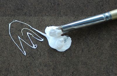
The white in the picture is a actually a mix between Williamsburg Flake white and Davis Davis Titanium White (known as the "Gluck" white as it was mixed to specifications by the founder of Mission Renaissance, a private art school in California.) Also the oil on the palette is M. Graham's Walnut oil. I included just a little of in the white mixture as the Williamsburg can be described as "stiff" and the Gluck white is "ropey". "Stropey" white was not what I wanted so the walnut oil smooths that out a bit. Why not Linseed oil you ask? Walnut oil is thinner and faster so it takes less oil to thin the paint to the desired consistency. Too much oil can contribute to cracking and yellowing.

At this point with the paint mixed I can begin applying the background. Since the wood is so dark it was pretty evident it needed to go on first as it surrounded the postcard and would influence the values I chose later:

Transparent Iron Oxide: a good influence
on unruly colours.

Close up.

While I spent a good deal of time mixing the "perfect" white, white was not used in the initial pass over the wood grain. In the close up you can see I've started to incorporate the "grain effect" on the left side while the initial base color is still being applied on the right. I like to work as I go rather than fully applying the paint in layers. Normally I would "tone" the canvas with a light wash on a neutral color, maybe a gray or mustardy wash. But since I am not using white here, I'm letting the white of the canvas show through to give me an impression of lighter wood.

After the initial layer of paint was allowed to dry (overnight) the wood grain was enhanced with a very limited amount of white added into the wood mixture. The tape above the card was painted and the shadows were darkened. for those of you interested, I did not use walnut oil other than in the white mixture (it dries too slow). The wood mixture was mixed with Oleo-Resin medium from Michael Harding. Basically: canada balsam, turpentine, stand oil and a drier (cobalt I think). It dried quickly has great handling and allowed me to thin the paint enough for the white ground to show through:

The completed wood grain

From here I could remove the tape and begin the figures and white border. The painting of the figures was relatively straight forward. The white border not so much. If you remember from the previous post I had rigged a complex light blocking "unicorn" to solve the fact that I had multiple light sources. This proved impractical. I removed the overhang early in the painting process but the dual light source was screwing with my ability to make the shadows and the highlights on the white border "read" properly.

It's purdy. But it don't read too good.

As you can see in the above photo I've turned off the spot light on the left causing the slanting show to disappear. Ultimately I thought this strengthened the illusion. The dual light source just seemed confusing. So I turned off the second light and just used the overhead light:


By George I think she's got it.

This concludes the series on the making of 'Degas "Dancers in Blue"'. I plan on doing a series of Tromp l'oeil paintings on similar themes as soon as I finish a few still-life's which have been requested by Mark Greenberg who carries my work in Santa Fe, NM at Greenberg Fine Art. Degas "Dancers in Blue" will also be showing there at the end of the month. Stay tuned for more painting madness and possibly, pictures of bunnies.

-F

Degas "Dancers in Blue" oil on linen 10" x 10"