I've entitled this series of post "The anatomy of a painting" for two reasons. First, I like titles to have five words and at least one preposition. It makes it sound like I'm very smart. I have degree that I paid a lot of money for and I feel like I should be using it in one way or another even if it's only to make me feel good about myself. Secondly, I think the title is appropriate. Paintings have an anatomy. They have a bone structure that keeps everything in place (the drawing) they have muscles that control it's movement (values) and they occasionally wear lipstick and perfume to get your attention (colour) Also they can wear too much lipstick and perfume and look like they are trying too hard. (i.e Diebenkorn)
So today we get into the makeup. Hopefully what I'm showing you is the equivalent of the "smokey eye effect" and not the "mutton dressed as lamb" effect. Firstly, a refresher as to where we left off:

Bones and Muscles. (Not really, but kinda)
when i got into teaching the phrase I would inevitably hear was "I can't learn to draw, I can;t even make a straight line without a ruler". My answer was always, "neither can I". Tromp l'oeil rests on the ability to form tight lines that separated the objects from their backgrounds. Because of this straight lines are fairly important, compulsory even. in fact they are so important they would require a longer word than compulsory but I can think of one at the moment.
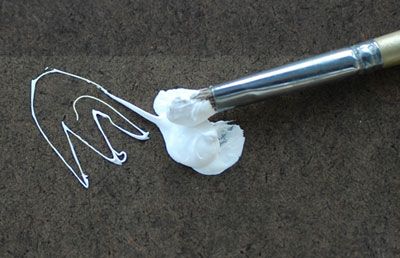
So, being that I am "straight line handicapped" and painting with a ruler is way more work than it sounds like, what the solution. The answer my friend, is tape.The edges of the tape are carefully mapped to the changing contours of the postcard. I used very small pieces, maybe 3/4 of an inch at a time, in order to perfectly mask off the postcard from what would become the wood background.

This is tape. And it is awesome
At this point the painting is finished and I can sign it. what? Paint? Ok fine.
The wood grain is basically a mix of Transparent Iron Oxide, Mars Black and a little Mars Violet and Cadmium Red to adjust the temperature.

Mars Violet isn't in this picture
because she's camera shy.
At this point with the paint mixed I can begin applying the background. Since the wood is so dark it was pretty evident it needed to go on first as it surrounded the postcard and would influence the values I chose later:

Transparent Iron Oxide: a good influence
on unruly colours.

Close up.
While I spent a good deal of time mixing the "perfect" white, white was not used in the initial pass over the wood grain. In the close up you can see I've started to incorporate the "grain effect" on the left side while the initial base color is still being applied on the right. I like to work as I go rather than fully applying the paint in layers. Normally I would "tone" the canvas with a light wash on a neutral color, maybe a gray or mustardy wash. But since I am not using white here, I'm letting the white of the canvas show through to give me an impression of lighter wood.
After the initial layer of paint was allowed to dry (overnight) the wood grain was enhanced with a very limited amount of white added into the wood mixture. The tape above the card was painted and the shadows were darkened. for those of you interested, I did not use walnut oil other than in the white mixture (it dries too slow). The wood mixture was mixed with Oleo-Resin medium from Michael Harding. Basically: canada balsam, turpentine, stand oil and a drier (cobalt I think). It dried quickly has great handling and allowed me to thin the paint enough for the white ground to show through:

The completed wood grain
From here I could remove the tape and begin the figures and white border. The painting of the figures was relatively straight forward. The white border not so much. If you remember from the previous post I had rigged a complex light blocking "unicorn" to solve the fact that I had multiple light sources. This proved impractical. I removed the overhang early in the painting process but the dual light source was screwing with my ability to make the shadows and the highlights on the white border "read" properly.

It's purdy. But it don't read too good.
As you can see in the above photo I've turned off the spot light on the left causing the slanting show to disappear. Ultimately I thought this strengthened the illusion. The dual light source just seemed confusing. So I turned off the second light and just used the overhead light:

By George I think she's got it.
This concludes the series on the making of 'Degas "Dancers in Blue"'. I plan on doing a series of Tromp l'oeil paintings on similar themes as soon as I finish a few still-life's which have been requested by Mark Greenberg who carries my work in Santa Fe, NM at Greenberg Fine Art. Degas "Dancers in Blue" will also be showing there at the end of the month. Stay tuned for more painting madness and possibly, pictures of bunnies.
-F

Degas "Dancers in Blue" oil on linen 10" x 10"


Wow, the blue tape really worked well. No bleed under at all. Like the finished painting frank.
ReplyDelete